I’m constantly saving packaging examples that catch my attention from week to week, whether it’s because of the thumbnail concept, thumbnail execution, or a really unique title I’ve never seen before.
So today, I wanted to break down 4 thumbnails & titles I saw this week that I absolutely loved - and more importantly, what we can learn from each one.
So let’s start with this first example below:
Firstly, the title and topic are already incredibly strong. The idea itself is so absurd and unique that viewers are going to want to watch the video simply because of the novelty.
Now, let’s analyze the complementary thumbnail details:
- The raw, low-resolution selfie screenshot style - this makes the concept realistic and instantly believable.
- The recognizable Target interior - immediately establishes the location and shows that he’s already actively doing this absurd challenge.
- Him looking serious and away from the camera - adds to the candid, vlog-style feel, but it also provides a glimpse into his personality; he looks completely unphased by what he’s doing, making the viewer curious about how he’ll interact with people in the store.
- Purple paint remnants on his shirt collar - a small detail that adds to the absurdity and comedy of the challenge. Not only are him and his bald head completely purple, but he couldn't even apply it neatly lol.
Let’s now look at this second example I saved:
Again, I absolutely love the title here. The intentional low-effort feel of the mostly lowercase title, and the use of “rn” instead of “right now” make it feel really unique.
It also adds to the story; he’s so underwhelmed by current tech that he couldn’t even be bothered to write out the title properly.
Let’s now analyze the complementary thumbnail details:
- The unique phone design - instantly catches your eye because phones haven’t looked like this in 15+ years. It creates novelty, while also tapping into nostalgia for sliding phones, physical buttons, colorful designs, etc.
- The realistic home background - makes it even more impressive that he seemingly built this from his own home. The minimally edited, realistic environment also makes the entire concept feel instantly believable.
- Him smiling in the background - makes it feel like he’s genuinely proud of what he built, especially in contrast to how underwhelmed he seems by current tech.
Now let’s have a look at this third example:
This is another example of really strong packaging.
The title establishes the idea clearly, and the word “Surrendered” immediately raises the stakes. It tells us the biting problem became serious enough that the owner felt they could no longer handle the dog themselves.
“I Sat Down Anyway” adds even more tension. The first half of the title establishes the threat, while the second half of the title emphasizes the risk he’s willing to take.
Let's look at the complementary thumbnail details:
- The dog’s facial expression - the dog looks intense and serious, which helps reinforce the perceived threat established by the title.
- The professional’s body language & facial expression - he’s sitting very still and keeping some distance from the dog. His calm, serious demeanor makes the image feel tense because it suggests that he's being very careful not to upset the dog.
- The small shelter room - immediately establishes the setting while adding even more tension. He’s sitting in a small, enclosed environment with a dog we’ve just been told has a history of biting.
Let’s now breakdown my very last example:
Love the simplicity and clarity in this title. “Level 1 to 100” instantly establishes a progression, while creating curiosity around how extreme these 3D prints are going to get.
And finally, let’s analyze the thumbnail details:
- 3D Printing on himself - immediately depicts one of the more elaborate 3D printing levels. He’s quite literally printing around his entire body, helping us visualize just how in depth these challenges might get.
- The painful facial expression, sweat, and steam - 3D printing can get very hot, and so including him sweating and visibly in pain adds tension and makes the challenge feel even more extreme. If this is one of the 3D print levels, it makes us curious about what the other challenges are going to be, and what type of consequences they might have.
- The 3D discard pieces on the table - this is a nice detail that makes the overall concept feel more believable. 3D printing often creates little discard pieces, so this detail makes the creation process more believable.
- The 3D printed Spider-Man suit - a great example of trendjacking. With a new Spider-Man movie recently released, this taps into a topic that already has a ton of attention and excitement around it.
These 4 examples are obviously very different from each other, but that’s exactly why I wanted to share them.
Great packaging doesn’t have to follow one specific style or formula. Sometimes it’s highly polished, sometimes it’s raw and minimally edited, and sometimes it’s just a really unique and novel.
That's why learning to analyze the individual details within packaging is so important. Once you understand why those details work, you can start breaking down and understanding packaging on any video, from any niche. (This will help you with your own thumbnail process as well!)
Thank you for reading! ツ
UPDATES👇👇👇
Later this week, I’ll be sharing a first look inside The Thumbnail Blueprint before it officially launches!
I’ll be giving you a sneak peek at what I’ve been working on since literally JANUARY of this year, and what you can expect inside the course.
So keep an eye on your inbox later this week, you won’t want to miss this one!
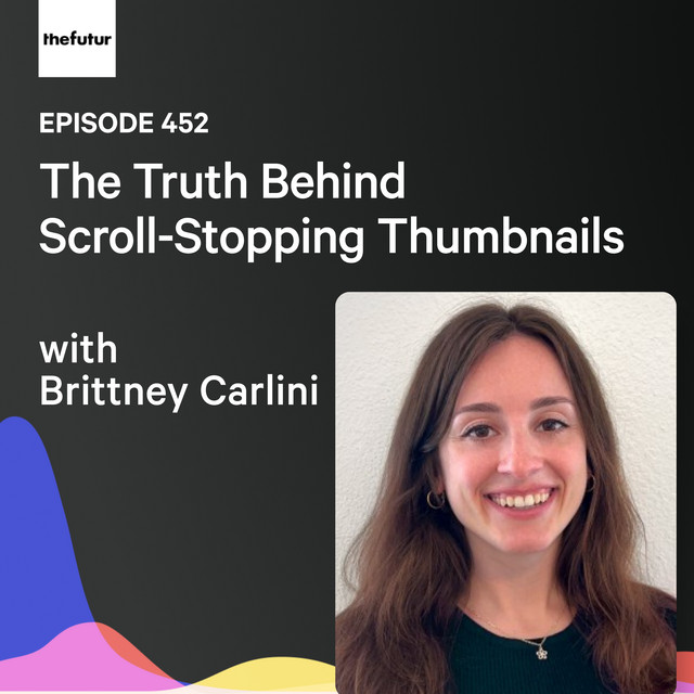
Additionally, my podcast episode with Chris Do from The Futur is finally out on Spotify!!! :) Feel free to check it out if you want to learn a couple of helpful thumbnail insights from Chris and I! The link is attached here, and below!
I hope you guys have an incredible week - Happy Fall! (Well, not in Texas. But still!!! 🍁🎃☕🦇🥧)
Not seeing my email content images or emails in your main inbox?
Please drag this message to your Primary tab, respond to this email, or check your promotions/junk folder and mark this as a "trusted sender".
600 1st Ave, Ste 330 PMB 92768, Seattle, WA 98104-2246
Unsubscribe · Preferences